Summary:
Why Warm Mahogany Is the 2026 Color of the Year
Warm Mahogany isn’t just another trendy color that’ll feel dated in two years. It’s a rich red with brown undertones that brings warmth and depth to residential spaces without overwhelming them—especially when applied through expert interior painting. Paint companies chose it because people are craving spaces that feel grounded, comfortable, and connected to something real—not sterile or staged.
After years of cool grays and stark whites dominating Bay Area interiors, homeowners want warmth back in their homes. Warm Mahogany delivers that without reading as overly traditional or rustic. It works in modern homes, craftsman-style spaces, and everything in between. The color evokes natural materials—think reddened soils, rust, and aged wood—which ties directly into the larger biophilic design movement shaping interiors right now.
What makes it especially practical for Contra Costa and Alameda County homes is its versatility. It holds up in both bright, sun-filled rooms and spaces with limited natural light. The brown undertones ground it, while the red hues add just enough energy to keep things from feeling flat or dull.
How to Use Warm Mahogany in Your Home
Warm Mahogany works best when you’re intentional about where and how you use it. It’s not a color you want on every wall in every room—that’s too much. Instead, think about it as an anchor that grounds your space and creates focal points.
Dining rooms and living rooms are natural fits. These are spaces designed for gathering, and Warm Mahogany creates an inviting, intimate atmosphere that encourages conversation without feeling heavy. It also works beautifully in entryways, where you want to make an immediate impression without feeling cold or sterile. In Walnut Creek or Lafayette homes with open floor plans, using Warm Mahogany in the dining area helps define the space without needing walls.
You can go bold with color drenching—painting walls, trim, and ceilings in the same hue for a fully immersive look. This technique has been trending in 2026 because it creates depth and sophistication without relying on pattern or texture. The result feels intentional and custom, not like you just picked a random wall color. If that feels like too much commitment, try it on a single accent wall or behind open shelving in the kitchen.
For bedrooms, Warm Mahogany can work, but you’ll want to balance it with softer tones to keep the space restful. Pair it with creamy whites or blush tones to prevent the room from feeling too heavy or dark. Lighting matters here—warm, layered lighting enhances the richness of the color, while harsh overhead lights can make it feel flat.
Cabinets are another smart application that’s gaining popularity in East Bay remodels. Warm Mahogany on kitchen islands or bathroom vanities adds a custom, high-end feel without requiring a full renovation. It pairs especially well with brass or matte black hardware, which brings out the color’s natural warmth and creates a sophisticated contrast.
The key is to use Warm Mahogany where you want to create a focal point or add warmth, then surround it with colors that either complement or soften its intensity. Don’t overthink it—just be intentional about placement.
What Finishes Work Best with Warm Mahogany
The finish you choose matters just as much as the color itself. Warm Mahogany looks and performs differently depending on whether you go with matte, eggshell, satin, or semi-gloss. Each finish has its place, and choosing the wrong one can undermine even the best color choice.
Matte finishes are ideal for living rooms and bedrooms where you want a soft, light-absorbing surface. Matte doesn’t reflect light, which means it hides minor imperfections in your walls and creates a calm, sophisticated look. The downside is that matte finishes are harder to clean, so they’re not the best choice for high-traffic areas or spaces prone to moisture like kitchens and bathrooms.
Eggshell has become the go-to finish for interior walls in 2026, and for good reason. It strikes the perfect balance between beauty and practicality. The subtle sheen adds depth to Warm Mahogany without highlighting every tiny flaw in your drywall. It’s also more durable and easier to wipe down than matte, which makes it a smart choice for main living areas in Contra Costa County homes where you’re balancing aesthetics with real life.
Satin finishes work well in kitchens, bathrooms, and hallways—anywhere you need durability and easy cleaning. Satin has a soft, pearl-like appearance that resists moisture and holds up to daily wear. If you’re using Warm Mahogany on cabinetry, satin is a solid choice because it’s wipeable and doesn’t show fingerprints as much as higher sheens. It’s also forgiving enough to work in spaces that get a lot of natural light without looking too shiny.
Semi-gloss is best reserved for trim, doors, and architectural details. The higher sheen creates contrast against eggshell or matte walls, which makes molding and trim pop and adds visual interest. If you’re painting doors in Warm Mahogany, semi-gloss is the way to go because it’s the most durable finish and can handle constant touching, opening, closing, and cleaning without showing wear.
The wrong finish can cheapen even the best color choice. If you’re unsure, test samples in your actual space under your actual lighting. Paint looks different at 9 a.m., 3 p.m., and 9 p.m., so give yourself time to see how it shifts throughout the day. This is especially important in Bay Area homes where natural light can vary dramatically depending on which direction your windows face.
Best Interior Paint Colors to Pair with Warm Mahogany
Warm Mahogany is rich and grounded, which means the colors you pair with it need to either complement that warmth or provide enough contrast to keep things interesting. The wrong pairings can make a space feel muddy, disconnected, or just off. The right ones create balance, depth, and a sense of intentional design.
Earth tones are the most natural fit. Think clay, terracotta, warm ochre, and soft taupes. These colors share Warm Mahogany’s connection to natural materials, which creates a cohesive, biophilic palette that feels calm and intentional—not forced or trendy. Biophilic design is all about bringing nature indoors, and these colors do exactly that without requiring you to turn your home into a forest.
Soft neutrals like cream, ivory, and warm beige provide breathing room. They lighten the space without competing with Warm Mahogany’s intensity. If you’re using Warm Mahogany on an accent wall or cabinetry, surrounding it with soft neutrals keeps the room from feeling too dark or heavy, which is especially important in smaller Alameda County homes where space is at a premium.

Earth Tones and Biophilic Color Palettes
Earth tones are having a moment in 2026, and they pair beautifully with Warm Mahogany. These are colors pulled directly from nature—clay, terracotta, warm sand, olive green, and muted gold. They create spaces that feel grounded, peaceful, and connected to the natural world, which is exactly what people are craving after years of overly sterile, Instagram-perfect interiors.
Clay and terracotta are especially popular right now in Bay Area remodels. These warm, earthy tones add richness without overpowering Warm Mahogany. You can use them on adjacent walls, in textiles like throw pillows and rugs, or as accent colors in artwork and decor. The key is to layer different shades of the same color family to create depth and visual interest without creating chaos.
Biophilic color palettes go beyond just earth tones. They include colors inspired by forests, stone, sand, and water—think muted greens, soft blues, and warm grays. These colors promote well-being and create a sense of calm, which is exactly what people are looking for in their homes right now. It’s not about following trends for the sake of it—it’s about creating spaces that actually feel good to live in.
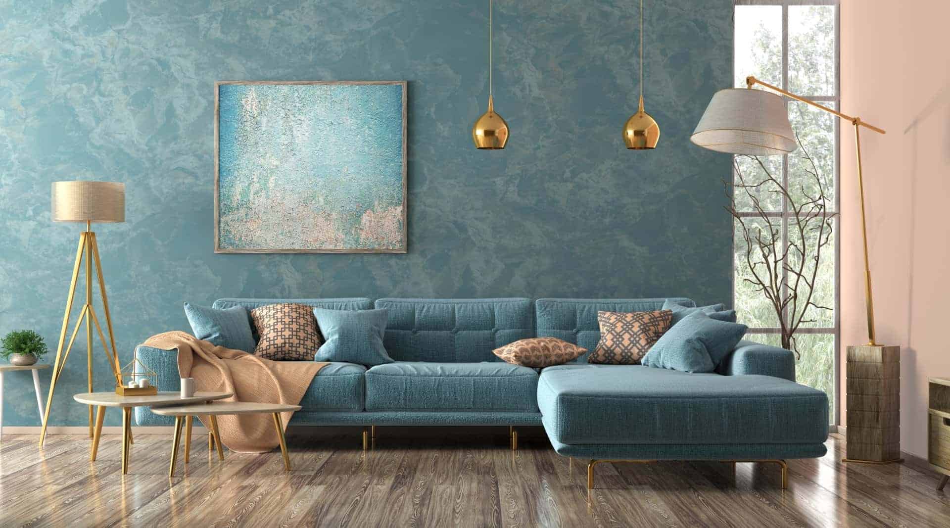
Sage green and eucalyptus are two biophilic colors that work particularly well with Warm Mahogany. The green tones provide a cool contrast to the warm red-brown of Mahogany, which keeps the space from feeling too monochromatic or flat. Use these colors in bedrooms or bathrooms where you want to create a restful, spa-like atmosphere. They’re especially effective in Contra Costa County homes where you’re trying to bring some of that outdoor California landscape feeling inside.
Warm ochre and muted gold add a subtle touch of luxury without feeling flashy or overdone. These colors have enough warmth to complement Warm Mahogany without competing with it. They work beautifully in dining rooms or living rooms where you want to create a sophisticated, inviting space that feels elevated but not stuffy. Think of them as the supporting actors that make the lead (Warm Mahogany) look even better.
The beauty of biophilic color palettes is that they’re naturally harmonious. Because they’re all pulled from nature, they work together in a way that feels effortless and unforced. You don’t have to overthink it—just choose colors that remind you of landscapes or natural materials you love, and they’ll likely pair well with Warm Mahogany. It’s one of those rare situations where trusting your instincts actually works.
Soft Neutrals and Accent Colors That Work
Soft neutrals are the backbone of any good color palette, and they’re especially important when you’re working with a bold color like Warm Mahogany. Cream, ivory, warm beige, and soft taupe all provide a clean, calming backdrop that lets Warm Mahogany shine without overwhelming the space or making it feel like you’re living inside a cave.
Creamy whites are a safe, timeless choice that never goes out of style. They brighten the room and create contrast without feeling stark or cold. If you’re using Warm Mahogany on an accent wall, painting the remaining walls in a warm white keeps the space feeling open and airy—especially important in East Bay homes where you’re trying to maximize natural light. The key is to choose whites with warm undertones—avoid anything too crisp or blue-toned, which will clash with Mahogany’s warmth and make the whole room feel disconnected.
Blush tones are another pairing that’s gaining traction in 2026 interiors. Soft pinks with warm undertones complement Warm Mahogany’s red hues without feeling overly feminine or trendy. This combination works especially well in bedrooms or powder rooms where you want to create a cozy, intimate feel that’s still sophisticated. It’s unexpected but works beautifully when executed well.
For accent colors, consider muted teal or smoky blue-green. These cooler tones provide contrast and keep the space from feeling too warm or heavy, which can happen if you layer too many warm colors together. Use them sparingly—on trim, doors, or in textiles—to add visual interest without disrupting the overall warmth of the palette. They’re especially effective in Alameda County homes with lots of natural light, where the cooler tones help balance the warmth.
Muted gold and brass accents also pair beautifully with Warm Mahogany. These metallic tones bring out the richness of the color and add a touch of sophistication without feeling flashy. Think brass light fixtures, gold-framed mirrors, or copper hardware on cabinetry. These small details elevate the entire space and make it feel more intentional and custom.
The goal with soft neutrals and accent colors is to create balance. Warm Mahogany is the star, but it needs supporting players that either enhance its warmth or provide enough contrast to keep things dynamic and interesting. Test your pairings in your actual space, under your actual lighting, before committing to anything. Colors that look perfect on a paint chip or Pinterest board can look completely different on your walls in your specific lighting conditions.
Choosing the Right Interior Paint Colors for Your Home
Warm Mahogany is a bold, grounded color that works beautifully in Contra Costa and Alameda County homes—but only when it’s paired with the right colors and finishes. Earth tones and biophilic palettes create harmony and connection to nature. Soft neutrals provide breathing room and balance. The right finish ensures durability and enhances the color’s natural richness without fighting against it.
The most important thing is to test your choices in your actual space, under your actual lighting. Paint shifts dramatically throughout the day, and what looks perfect in the morning might feel completely different by evening. Give yourself time to live with samples before making a final decision—it’s worth the extra few days to get it right.
If you’re planning a remodel or refresh and want expert guidance on color selection, finishes, and application, we bring over four decades of combined experience to every project in the East Bay. We understand Bay Area homes, local building codes, and how to make color choices that last beyond this year’s trends.